W3.CSS မိတ်ဆက် (မီးဖိုချောင်သုံး ရေကန်)
W3.CSS အရောင်များ
w3-colour အတန်းများကို စျေးကွက်ချဲ့ထွင်မှု၊ လမ်းဆိုင်းဘုတ်များနှင့် ကပ်စေးကပ်မှတ်စုများတွင် အသုံးပြု သည့် ခေတ်မီအရောင်များဖြင့် မှုတ်သွင်းထားသည်။
W3.CSS ကွန်တိန်နာများ
w3-container အတန်း သည် W3.CSS အတန်းများတွင် အရေးအကြီးဆုံးဖြစ်သည်။ တန်းတူညီမျှမှုကို ပေးဆောင်သည်-
- ဘုံအနားသတ်များ
- အသုံးများသော အကွက်များ
- အများအားဖြင့် ဒေါင်လိုက် ချိန်ညှိမှုများ
- ဘုံအလျားလိုက် ချိန်ညှိမှုများ
- အသုံးများသောဖောင့်များ
- အသုံးများသောအရောင်များ
w3-container အတန်းကို အများအားဖြင့် HTML ကွန်တိန်နာဒြပ်စင်များကဲ့သို့သော၊
<div>၊ <header>၊ <footer>၊ <article>၊ <section>၊ <blockquote>၊ <form> နှင့် အခြားအရာများ။
ဒါက Header ပါ။
ဤဆောင်းပါးသည် မီးခိုးရောင်ဖြစ်ပြီး စာသားသည် အညိုရောင်ဖြစ်သည်။ ဤဆောင်းပါးသည် မီးခိုးရောင်ဖြစ်ပြီး စာသားသည် အညိုရောင်ဖြစ်သည်။ ဤဆောင်းပါးသည် မီးခိုးရောင်ဖြစ်ပြီး စာသားသည် အညိုရောင်ဖြစ်သည်။ ဤဆောင်းပါးသည် မီးခိုးရောင်ဖြစ်ပြီး စာသားသည် အညိုရောင်ဖြစ်သည်။ ဤဆောင်းပါးသည် မီးခိုးရောင်ဖြစ်ပြီး စာသားသည် အညိုရောင်ဖြစ်သည်။
ဒါက အောက်ခြေမှတ်စုတစ်ခုပါ။
W3.CSS အကန့်များ၊ မှတ်စုများနှင့် ကိုးကားချက်များ
w3-panel အတန်း သည် မှတ်စုများနှင့် ကိုးကားချက်များ အမျိုးအစားအားလုံးကို ပြသနိုင်သည်-
လန်ဒန်သည် United Kingdom တွင် လူဦးရေအများဆုံးမြို့ဖြစ်ပြီး မြို့ပြဧရိယာသည် လူဦးရေ ၉ သန်းကျော်ရှိသည်။
လန်ဒန်သည် United Kingdom တွင် လူဦးရေအများဆုံးမြို့ဖြစ်ပြီး မြို့ပြဧရိယာသည် လူဦးရေ ၉ သန်းကျော်ရှိသည်။
W3.CSS သတိပေးချက်များ
w3-panel အတန်း သည် သတိပေးချက်အမျိုးမျိုးအတွက်လည်း အသုံးပြုနိုင်သည်။
အန္တရာယ်!
အနီရောင်သည် အန္တရာယ်ရှိသော သို့မဟုတ် အဆိုးမြင်အခြေအနေတစ်ခုကို ညွှန်ပြလေ့ရှိသည်။
သတိပေးချက်
အဝါရောင်သည် မကြာခဏ သတိထားရမည့် သတိပေးချက်ကို ညွှန်ပြသည်။
အောင်မြင်
အစိမ်းရောင်သည် အောင်မြင်မှု သို့မဟုတ် အပြုသဘောဆောင်သော အရာတစ်ခုကို ညွှန်ပြလေ့ရှိသည်။
အချက်အလက်
အပြာရောင်သည် ကြားနေ သတင်းအချက်အလက် ပြောင်းလဲမှု သို့မဟုတ် လုပ်ဆောင်ချက်ကို မကြာခဏ ညွှန်ပြသည်။
ဥပမာ
<div class="w3-panel w3-yellow">
<h3>Warning!</h3>
<p>Yellow often indicates a warning that might need attention.</p>
</div>
W3.CSS ကတ်များ
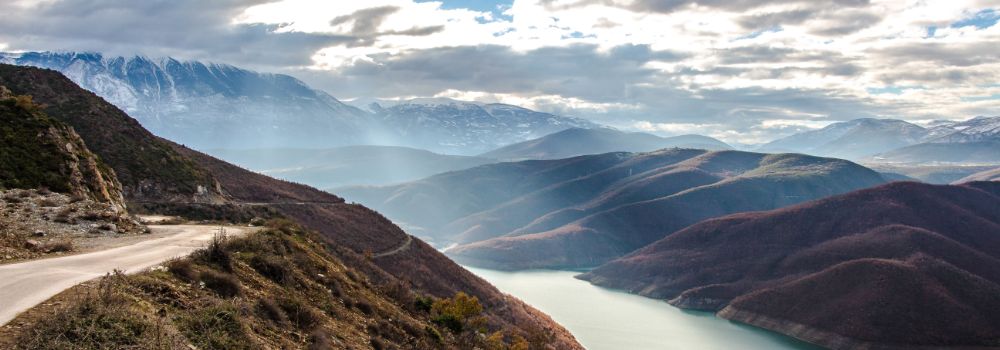
w3-card အတန်းများသည် ရုပ်ပုံများနှင့် မှတ်စုနှစ်ခုလုံးအတွက် သင့်လျော်သည် -
ကားတစ်စင်း
ကားသည် သယ်ယူပို့ဆောင်ရေးတွင် အသုံးပြုသည့် ဘီးတပ်၊ ကိုယ်တိုင်စွမ်းအင်သုံး မော်တော်ကားဖြစ်သည်။ ဝေါဟာရ၏ အဓိပ္ပါယ်ဖွင့်ဆိုချက်အများစုသည် ကားများကို လမ်းများပေါ်တွင် အဓိကမောင်းနှင်ရန်၊ လူတစ်ဦးမှ ရှစ်ဦးအထိ ထိုင်ခုံထားရှိရန်နှင့် ပုံမှန်အားဖြင့် ဘီးလေးဘီးပါရန် ဒီဇိုင်းထုတ်ထားကြောင်း သိရသည်။
(ဝီကီပီးဒီးယား)
အံ့သြစရာ

ပြင်သစ်တောင်တန်း
ဥပမာ
<div class="w3-card-4">
<img src="img_snowtops.jpg" alt="Alps">
<div class="w3-container w3-center">
<p>French Alps</p>
</div>
</div>
W3.CSS ဇယားများ
w3-table အတန်း များသည် စားပွဲ အမျိုးအစားအားလုံးကို ကိုင်တွယ်နိုင်သည်-
| နာမည် | မျိုးနွယ်အမည် | အမှတ်များ |
|---|---|---|
| ဂျေးလ် | စမစ် | ၅၀ |
| ဧဝ | လုပ်ပြတယ်။ | ၉၄ |
| အာဒံ | ဂျွန်ဆင် | ၆၇ |
| အန်ဂျာ | ဖေဖေ့ကို | ၁၀၀ |
ဥပမာ
<table class="w3-table w3-striped w3-border">
W3.CSS စာရင်းများ
w3-ul အတန်း သည် စာရင်းအမျိုးအစားအားလုံးကို ကိုင်တွယ်နိုင်သည်-
-
 Mike
Mike
Web Designer -
 Jill
Jill
ထောက်ခံမှု -
 Jane
Jane
စာရင်းကိုင် -
 Jack
Jack
Advisor
ဥပမာ
<ul class="w3-ul w3-border">
<li><h2>Names</h2></li>
<li>Jill</li>
<li>Eve</li>
<li>Adam</li>
</ul>
W3.CSS ခလုတ်များ
w3-button နှင့် w3-btn အတန်း သည် အရွယ်အစားနှင့် အမျိုးအစားအားလုံး၏ ခလုတ်များကို ပံ့ပိုးပေးသည်။
ကျယ်ပြန့်သောခလုတ်များ
စက်ဝိုင်း သို့မဟုတ် လေးထောင့်ခလုတ်များ-
W3.CSS တဂ်များ၊ အညွှန်းများ၊ တံဆိပ်များနှင့် ဆိုင်းဘုတ်များ
w3-tag နှင့် w3-badge အတန်း များသည် တဂ်များ၊ အညွှန်းများ၊ တံဆိပ်များနှင့် ဆိုင်းဘုတ် အမျိုးအစားအားလုံးကို ပြသနိုင်သည်-
၂ ၈ တစ် ခ
အသစ် သတိပေးချက် အန္တရာယ် အချက်အလက်
အောက်မှာ အသက် မ ရှုပါနှင့်
W3.CSS တုံ့ပြန်မှု
Responsive Grid အတန်း များသည် စက်ပစ္စည်းအမျိုးအစားအားလုံး- PC၊ လက်ပ်တော့၊ တက်ဘလက်နှင့် မိုဘိုင်းအတွက် တုံ့ပြန်မှုပေးပါသည်။
၁/၂
၁/၂
၁/၃
၁/၃
၁/၃
၁/၃
၂/၃
၁/၄
၁/၄
၁/၄
၁/၄
၁/၂
၁/၄
၁/၄
၂/၃
၁/၃
၁/၁
၁/၄
၁/၄
၁/၂
၁/၄
၁/၂
၁/၄
50px
အနားယူပါ။
၁/၄
အနားယူပါ။
100px
45px
အနားယူပါ။
W3.CSS သည် အသေးစား၊ အလတ်စားနှင့် ကြီးမားသောအတန်းများ ပါရှိသော မိုဘိုင်း-ပထမအရည်ချင်းဇယားကွက် 12 ကော်လံ ကိုလည်း ပံ့ပိုးပေးပါသည်။
W3.CSS ရုပ်ထွက်
w3-display အတန်းများသည် သင့်အား တိ ကျသောနေရာများတွင် HTML အစိတ်အပိုင်းများကို ပြသနိုင်စေသည်-

W3.CSS Modals များ
w3-modal အတန်း သည် သန့်စင်သော HTML တွင် modal dialog ကို ပေးသည်-
မော်ဒယ်ပုံ-


W3.CSS တိုးတက်မှုဘားများ
W3.CSS Progress Bars တွင် ပိုမိုဖတ်ရှုပါ။
W3.CSS Dropdowns
w3-dropdown အတန်းများသည် dropdowns များကိုပေးသည် -
W3.CSS Accordions
Read more at W3.CSS Accordions
Lorem ipsum dolor sit amet, consectetur adipisicing elit, sed do eiusmod tempor incididunt ut labore et dolore magna aliqua. Ut enim ad minim veniam, quis nostrud exercitation ullamco laboris nisi ut aliquip ex ea commodo consequat.
Accordion with Images:
French Alps
W3.CSS Tabs
Tabs are perfect for single page web applications, or for web pages capable of displaying different subjects.
London
London is the capital of England.
It is the most populous city in the United Kingdom, with a metropolitan area of over 9 million inhabitants.
Tabbed Image Gallery (Click on one of the pictures):


W3.CSS Navigation
The w3-bar class can be used to create a navigation bar:
Navigation bar with input:>
Navigation bar with dropdown:
The w3-sidebar class creates a side navigation:
W3.CSS Pagination
W3.CSS provides simple ways for page pagination.
Slideshows
W3.CSS provide slideshows for cycling through images or other content:
Lightbox
Combine Modals and Slideshows to create a lightbox (modal image gallery):
Nature and sunrise
❮ ❯
W3.CSS Animations
The w3-animate classes provide an easy way to slide and fade in elements:
W3.CSS Images
Styling images in W3CSS is easy:

W3.CSS Effects
Add special effects to any element:

Opacity
Grayscale
Sepia
W3.CSS Input Forms
The w3-input classes are for input forms:
Input Form
Input Form
W3.CSS Filters
Use W3.CSS Filters to search for a specific element inside a list, table, dropdown, etc:
| Name | Country |
|---|---|
| Alfreds Futterkiste | Germany |
| Berglunds snabbkop | Sweden |
| Island Trading | UK |
| Koniglich Essen | Germany |
| Laughing Bacchus Winecellars | Canada |
| Magazzini Alimentari Riuniti | Italy |
| North/South | UK |
| Paris specialites | France |
W3.CSS Fonts
With W3.CSS it is extremely easy to add fonts to a web page:
W3.CSS Tooltips
The w3-tooltip class can display all kinds of tooltips:
Hover over this text! Tooltip content
Hover over this text! Tooltip content
Color Themes
Color themes can easily be added to any web application:
Theme Indigo
Movies 2014
-
Frozen
The response to the animations was ridiculous
-
The Fault in Our Stars
Touching, gripping and genuinely well made
-
The Avengers
A huge success for Marvel and Disney
Theme Teal
Movies 2014
-
Frozen
The response to the animations was ridiculous
-
The Fault in Our Stars
Touching, gripping and genuinely well made
-
The Avengers
A huge success for Marvel and Disney
Color themes are a perfect match for mobile applications.